• UX
  • UI
  • Experience
  • Innovation
  • Technology
  • Creativity
  • Atlis
  • Web
  • Atlis Web
Loaded
Web Experience
RomemberMe
The project designed and implemented for photographer Anna Sincini focuses on
one of her strong suits, weddings.

Project Challenge

Objective

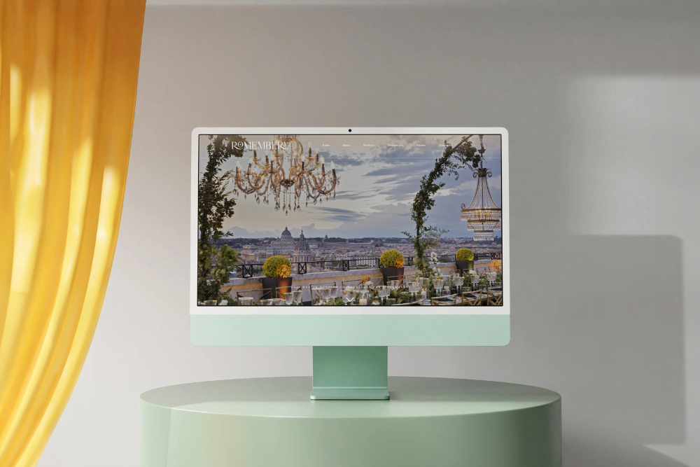
With Romember Me, the main goal was to create an engaging and memorable user experience that would inspire and inform couples about Anna's photography service. Therefore, we decided to develop a website that not only showcased Anna's work in the best possible way but also provided an intuitive platform for users.

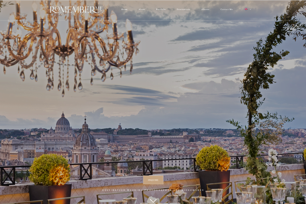
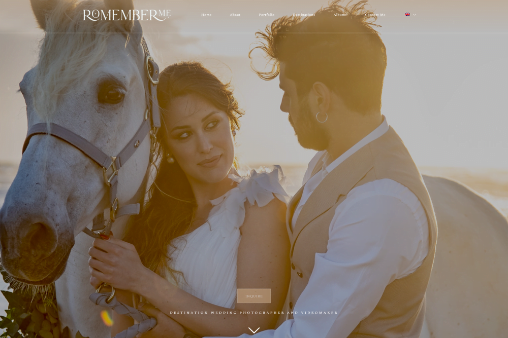
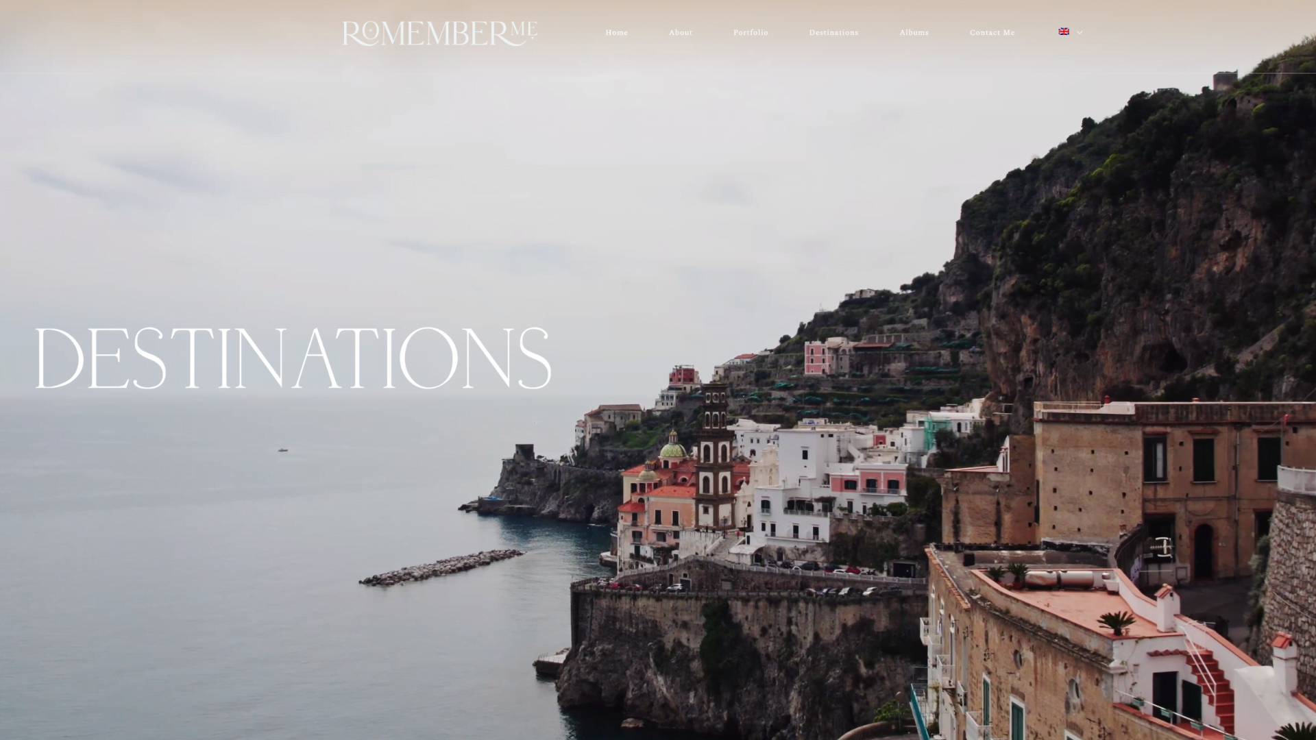
 We have developed a responsive design and user-centric navigation to immerse the customer in the world of Romember me. We have also designed a simple way to display essential information while keeping the background of each page minimal, allowing Anna to showcase her photographs and make them stand out.

Design Approach

Our Method

To achieve this, we designed an interactive layout aimed at capturing the visitor's attention. We utilized a combination of motion effects and animations to create unique browsing experiences. Additionally, we incorporated larger-than-average images to enhance the photographer's visuals, while implementing parallax scrolling technique to amplify the visual impact.

Thanks to all these elements, we have created an interactive design that keeps the browsing experience fresh and exciting, encouraging visitors to keep scrolling the page.

Colors
A classic and elegant color combination, perfect for a wedding photography website. We have chosen black (#000000) and white (#ffffff) as the primary colors to create a sophisticated and timeless look. To add warmth and depth to the palette, we have selected a warm beige (#c5a583) and a soft cream white (#f3e5dd) as accent colors.


Font
As for the typography, we have chosen to use the Le Mores collection as the primary font, using the Serif variant for an elegant and sophisticated look. As a secondary font, we have chosen the Script variant from the same collection, to add a touch of elegance and personality. For the main text, we chose Minion Pro Regular, a classic and readable font that fits perfectly with the chosen color palette.


Il Risultato

Feedback

The Romember me project achieved great success with Anna Sincini, who said she was happy and enthusiastic about the result. Our goal was to create a site that could convey the feeling of a wedding, an emotional experience: thanks to the extensive use of images, colors and videos, we have achieved that goal. We have also used a dedicated portfolio section where couples can see Anna's services.

The customer's feedback has been extremely positive, exceeding her expectations. He stated that he is thrilled with how we have made his work visible to all, giving a unique experience to site visitors.

UI UXApp Ecommerce
CereriaDi Giorgio
en_USEN